Brand is how others perceive you. It’s the theme that conveys who you are at a glance. It’s recognizable.
As authors, we all want our website to look good. We want it to present our work in a professional manner. Appearances matter and your website needs to look fresh, not clunky or worse, dated.
How do you get there? Luckily, branding and design basics are something you can learn. That’s what this post is about.
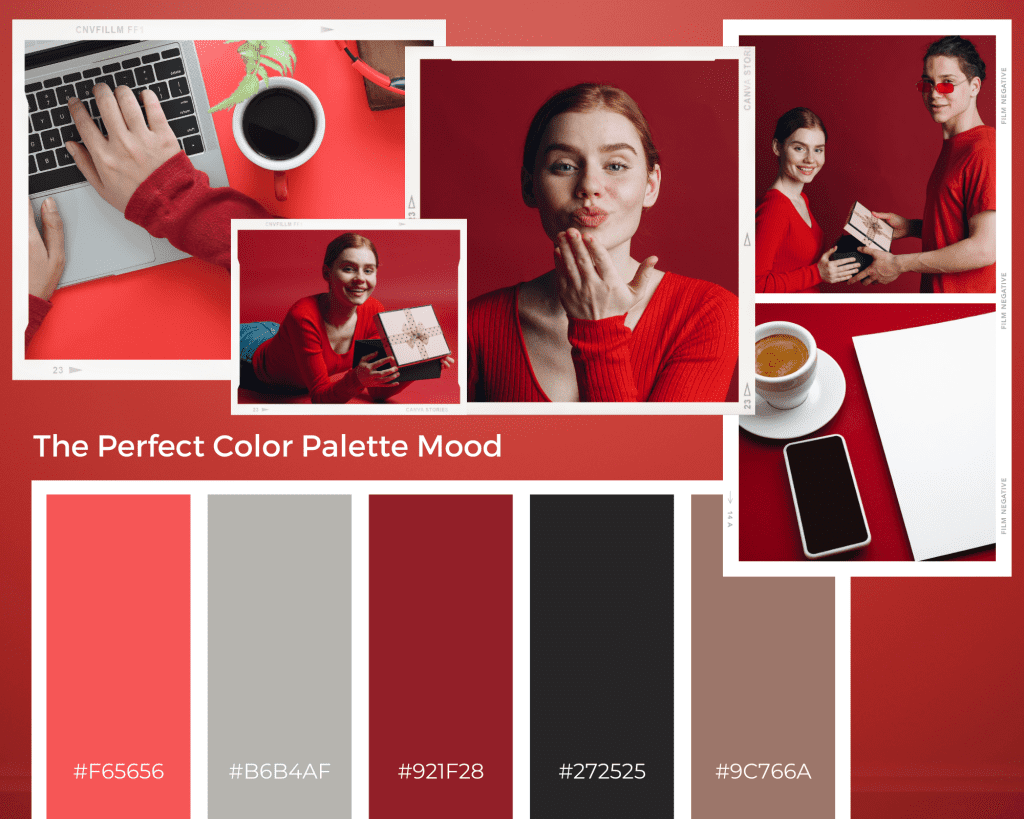
On your website there are three ways to convey your personality, aside from the obvious, your words and other content. I’m talking about fonts, colors and images.
- A solid layout.
- Good typography.
- The right color scheme.
- Effective use of design elements like images and icons.
3 Rookie Mistakes Authors Make with Branding
It’s more than your logo or font choice. It extends to your writing tone, your word choice and the imagery you use. And if you get it wrong, you won’t connect with your readers.
Being Generic
You can’t be memorable when you try to cater to everyone instead of your reader. Everyone won’t read what you write, and that’s the way it is for every writer. When you try to please everyone the result is boring. You can’t please everyone, so don’t even try.
Be yourself. Show your quirks, your interests, your personality through your choice of color, fonts and imagery on your website. Show who you are. Your authenticity will resonate and connect you with the right readers.
Lack of consistency
Your brand is more than your website, it’s the face you show the world online. Your brand is how people get to know you online. Being consistent in your presentation helps you become more memorable and familiar to your audience. It builds connection.
Wherever you appear online, your website and social media profiles should all be recognizable as you. Use the same colors, fonts and imagery on all of your properties. For example your cover images should be similar to your website’s design. If you write thrillers you probably wouldn’t use a flowing script font on your book cover, it wouldn’t be on brand. But it would make perfect sense for a romance writer.
Being too clever or too cutesy.
Instead, you want to be memorable and to be memorable, people need to be able to read and understand your branding elements like your logo and tagline. Using too many graphic elements or combining clashing styles or colors is just confusing.
Your brand is more than your logo, it pulls all the visual elements and even your word choice and voice together to communicate who you are and sets the tone for your culture and community.
