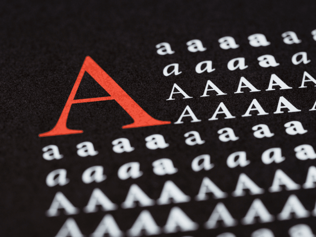
When it comes to your website, what difference do fonts make? It turns out, a lot.
- The number one reason typography matters is for readability.
- Making good choices for your fonts means your site will be easy to ready, easy to scan.
- The right typography looks professional and lends credibility to your content.
- Your font choices set the tone for your website and brand.
Tips to Achieve Good Typography
- The fonts you choose: whether serif or sans serif, remember that the design of the fonts themselves convey feeling and voice. Try serif for headings and sans serif for your body text.
- Consider how they’ll look on a variety of devices, being easily skimmable is key.
- Limit the number of fonts you use on your site. Too many are distracting. Loading too many fonts will slow down your site.
- Spacing: consider line spacing and even the spacing between characters. Too much spacing and the meaning is lost. Too little spacing and everything is bunched together. Both make it harder to read and understand.
- The colors you use: use colors with proper contrast between background and text. Colors too close to each other will be hard to read.
The fonts you choose are also extremely important. They do more than style the text on your pages, they also convey the flavor of your personality and your work. A well thought out combination of fonts will make your website easy to read.
How to choose font combinations for your website
Two main types of fonts: Serif and Sans Serif
Serif fonts have extra decorative strokes on the ends of the letters, sometimes referred to as tails or feet. Seen as more classic. Times New Roman is likely on your computer and is a serif font.
Examples of serif fonts are:
- https://fonts.google.com/specimen/Roboto+Serif
- https://fonts.google.com/specimen/Cormorant
- https://fonts.google.com/specimen/Merriweather
Sans Serif fonts are cleaner, without the extra decorative flourish. Seen as more modern. Arial or Helvetica are likely on your computer and are sans serif fonts.
Examples of sans serif fonts are:
- https://fonts.google.com/specimen/Roboto
- https://fonts.google.com/specimen/Montserrat
- https://fonts.google.com/specimen/Poppins
There are also display fonts, script fonts and others. These may be better suited to creating logos or other graphics, since they can be harder to read.
Examples of script fonts are:
- https://fonts.google.com/specimen/Euphoria+Script
- https://fonts.google.com/specimen/Dancing+Script
- https://fonts.google.com/specimen/Allura
- https://fonts.google.com/specimen/Yesteryear
More Resources for Fonts
Here are several resources to explore fonts and font pairings.
Google fonts is a great free tool that makes it easy to add custom fonts to your site. These can be added via your theme, coding tweaks to your theme if it doesn’t provide a means to handle this or through a plugin you can install on your site.
Head over to the Google fonts website https://fonts.google.com/ and you can test drive different combinations of fonts and see what they look like at different sizes and with different text. You don’t have to download anything to use the fonts, just make note of the fonts you like and jot down their name.
There are even several sites devoted to font combinations that work well together.
- http://fontpair.co/
- https://fontjoy.com/
- https://femmebot.github.io/google-type/
- https://www.canva.com/learn/the-ultimate-guide-to-font-pairing/
- https://fonts.google.com/knowledge/choosing_type/pairing_typefaces
Choose 2 fonts: one for your headings and titles and one for the body text. You might have a third as an accent, but no more than that, it becomes cluttered and overwhelming, distracting and makes it hard to read. Too many fonts also slows down the loading time of your website and performance is important.
Using too many fonts is the biggest mistake. It makes your site hard to read, it adds to the load time of your web pages and makes your site look unprofessional.
Your platform will have a theme that assigns fonts for your website to keep things consistent. Learn why cutting and pasting from Word with special formatting is a mistake.
