Color is another way to communicate what you’re about. Choosing the right color palette will help your audience know more about you at a glance.
How to choose colors for your website.
There are 4 different types of color schemes: monochromatic, analogous, complementary and triad. Each of these combines colors in different ways. You’ll want to represent your personality as an author and what you write about in your color selection.
Consider the psychology of color and how color affects our perception.
- Blue – trust, authenticity, peace
- Green – creative, nature, growth
- Red – danger, power, passion, desire, love
- Yellow – sunshine, light, energy, hope, optimism
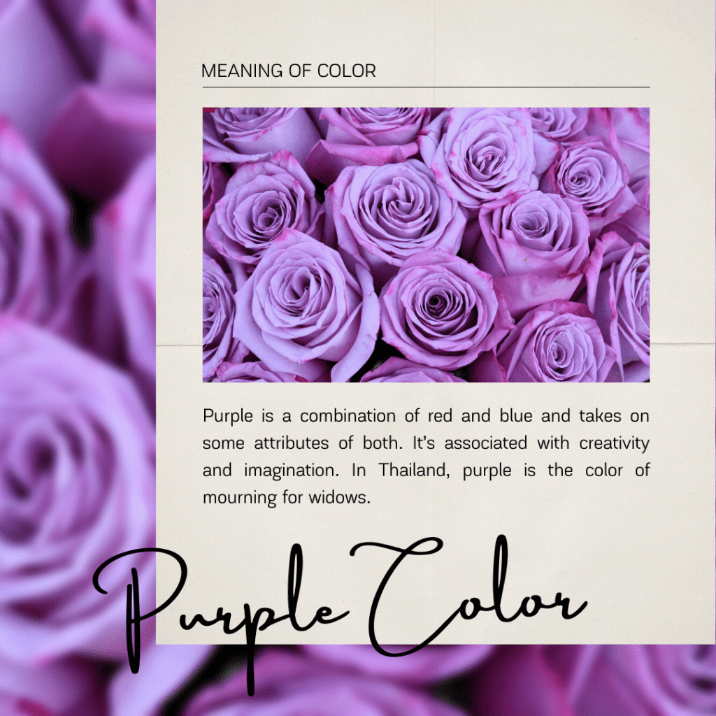
- Purple – royalty, luxury, wealth, mystery, magic
- Orange – joy, happiness, stimulation
For example: thriller writers tend to choose bold color combinations, with black, red and white. Romance often features jewel tones, deep reds and blues. Fantasy sees purples and greens, with metallic accents. Start with what you’re naturally drawn to.
Color Choice Dos and Donts
- Don’t use too many colors. It makes for a distracting and confusing website.
- Do choose 3 main colors plus an off-black and off-white for your palette.
- Don’t choose colors that clash or don’t work together. For example some shades of red and green or red and blue that vibrate when used together.
- Don’t use light colored text on a light colored background or dark text on a dark background.
- Do balance your use of color, think the 60/30/10 rule and apply that to your primary color, secondary color and accent color.
Avoid author branding mistakes.
Choosing Your Colors
Your site should have an overall color scheme that gets used consistently on backgrounds, borders, headlines, links, menus and more. Choosing your colors ahead of time lets you set them up from the beginning and this will save you time as you begin building your site.
You’ll want 3 to 5 colors for your site plus a black and white.
- Main color – This will be the lead color on the site and be used for things like your header,
- Navigation or other element backgrounds, it is also the color that will be used most frequently.
- Accent color – this is another dominant color or it can be a shade or tint of your main color.
- Call to Action color – this color should contrast and stand out from the other colors. You’ll
- Use this for your newsletter buttons or other calls to action on your site.
Here are a few sites you can use to generate a color palette:
